Website Design & Development
 Web Application Development
 Branding & Logo Design
 Care Plans & Maintenance



 WordPress
 Laravel
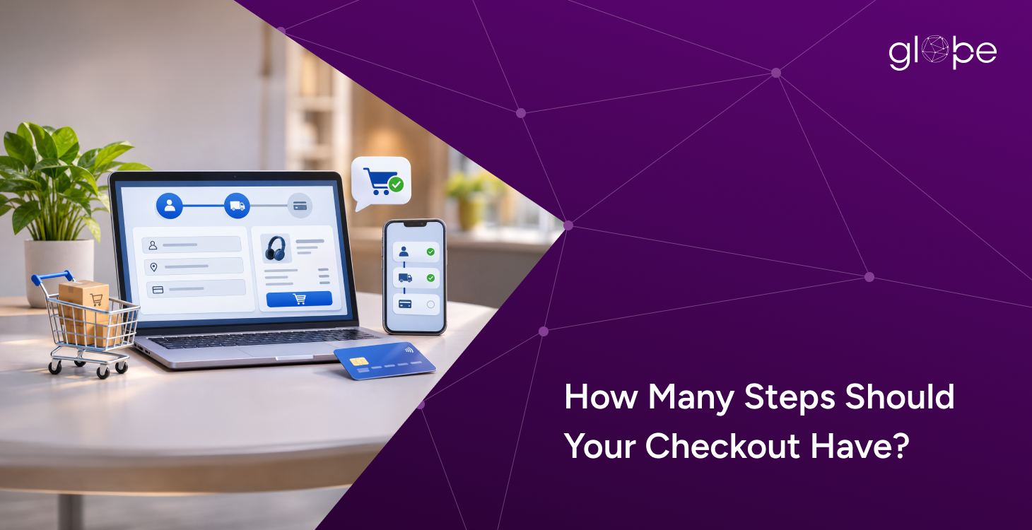
How many steps should your checkout have? Most e-commerce stores thrive with a 1-to-3-step checkout process depending on product complexity, shipping needs, and payment methods. The ideal checkout length is simply the minimum number of steps required for customers to purchase easily and securely. A single-page checkout excels for straightforward orders, whereas a multi-step checkout works better when collecting detailed customer information. Simplifying form fields, removing friction, and showing costs upfront significantly improve conversion rates. Ultimately, businesses should rely on customer behavior and analytics data—rather than assuming fewer screens always lead to higher sales.
What Is the Ideal Number of Checkout Steps?
A one-page checkout combines customer details, delivery information, payment, and order review on a single screen. It can be effective for simple purchases, particularly when the form remains short and easy to navigate. A two-step checkout typically separates customer and shipping information from payment and order review, making the process easier to scan. A three-step checkout can divide customer details, delivery and payment, and final order review into distinct stages. This structure can help customers understand what information they need to provide at each point.
Single-Page vs. Multi-Step Checkout
Neither approach is universally better because checkout performance depends on form complexity, mobile usability, and customer expectations. A single-page checkout can reduce navigation, but a long form may overwhelm customers. A multi-step checkout can make complex information easier to manage, provided each stage serves a clear purpose and customers can understand their progress. The objective is to minimise unnecessary effort rather than simply reduce the number of screens.
What Determines the Right Checkout Structure?
The complexity of the purchase should guide checkout design. A store selling standard accessories may need only contact details, a shipping address, and payment information, whereas customised products, furniture, or wholesale orders may require additional specifications or delivery arrangements. Payment methods also matter because express checkout options and digital wallets can reduce manual data entry where supported. Businesses should remove optional fields that do not support order processing, fulfilment, or essential requirements, while avoiding duplicate requests for information customers have already supplied.
Shipping costs, taxes, delivery estimates, and applicable charges should be visible before customers commit to payment. Guest checkout can also reduce barriers for first-time buyers who do not want to create an account before purchasing. On mobile devices, readable forms, appropriately sized buttons, address autofill, and clear validation messages make the process easier to complete. If checkout has multiple stages, a progress indicator and the ability to return to previous steps without losing entered information can improve usability.
Steps Should Your Checkout Have: How to Optimise Checkout for More Conversions
Start by reviewing the complete journey from the shopping cart to the order confirmation page. Identify unnecessary fields, confusing instructions, unexpected costs, payment failures, and errors that interrupt the purchase. Simplify the form, make the order total easy to understand, provide suitable payment options, and let customers review their purchase before submitting payment. These changes should address specific sources of friction rather than remove steps that are necessary for accurate order processing.
Next, use ecommerce analytics to understand where customers abandon checkout. Monitor checkout initiation, progression between stages, form errors, payment failures, and completed purchases. Test changes such as guest checkout, fewer fields, express payments, or a different page layout against the existing experience. Evaluate completed orders and relevant business outcomes instead of relying on clicks alone.
Glopbe helps businesses develop and optimise ecommerce websites with a focus on responsive design, usability, and conversion-oriented experiences. A well-designed checkout should make purchasing straightforward while retaining the information and safeguards required to process orders successfully.
Frequently Asked Questions
1. How many checkout steps are ideal for an ecommerce website?
One to three steps is a practical starting point for many ecommerce websites. The ideal structure depends on the information required, payment options, delivery arrangements, and complexity of the purchase.
2. What should each checkout step include?
A simple three-stage checkout can collect customer and shipping details first, present delivery and payment options second, and provide an order summary with the final purchase action third. Simpler stores may combine these stages.
3. Is a single-page checkout better than a multi-step checkout?
Not always. Single-page checkout can reduce navigation, while multi-step checkout can make longer forms easier to manage. The best option is the one that allows customers to complete their orders with the least unnecessary effort.
4. Can reducing checkout fields lower cart abandonment?
Removing unnecessary fields can reduce form-filling effort and improve usability. However, checkout abandonment also depends on unexpected costs, payment problems, delivery options, and customer trust.
5. How can I measure checkout performance?
Track checkout completion rates, abandonment at each stage, form errors, payment failures, and completed purchases using ecommerce analytics. Compare performance before and after changes to determine whether the revised checkout improves results.
Cleanup order is easy to get wrong.
Get expert help from Globpe.
Your website should make it clear who you are, what you offer and what visitors should do next. Whether you are launching a new digital presence or improving an existing website, start with the goals, customers and opportunities that matter most to your business.