Website Design & Development
 Web Application Development
 Branding & Logo Design
 Care Plans & Maintenance

 WordPress
 Laravel
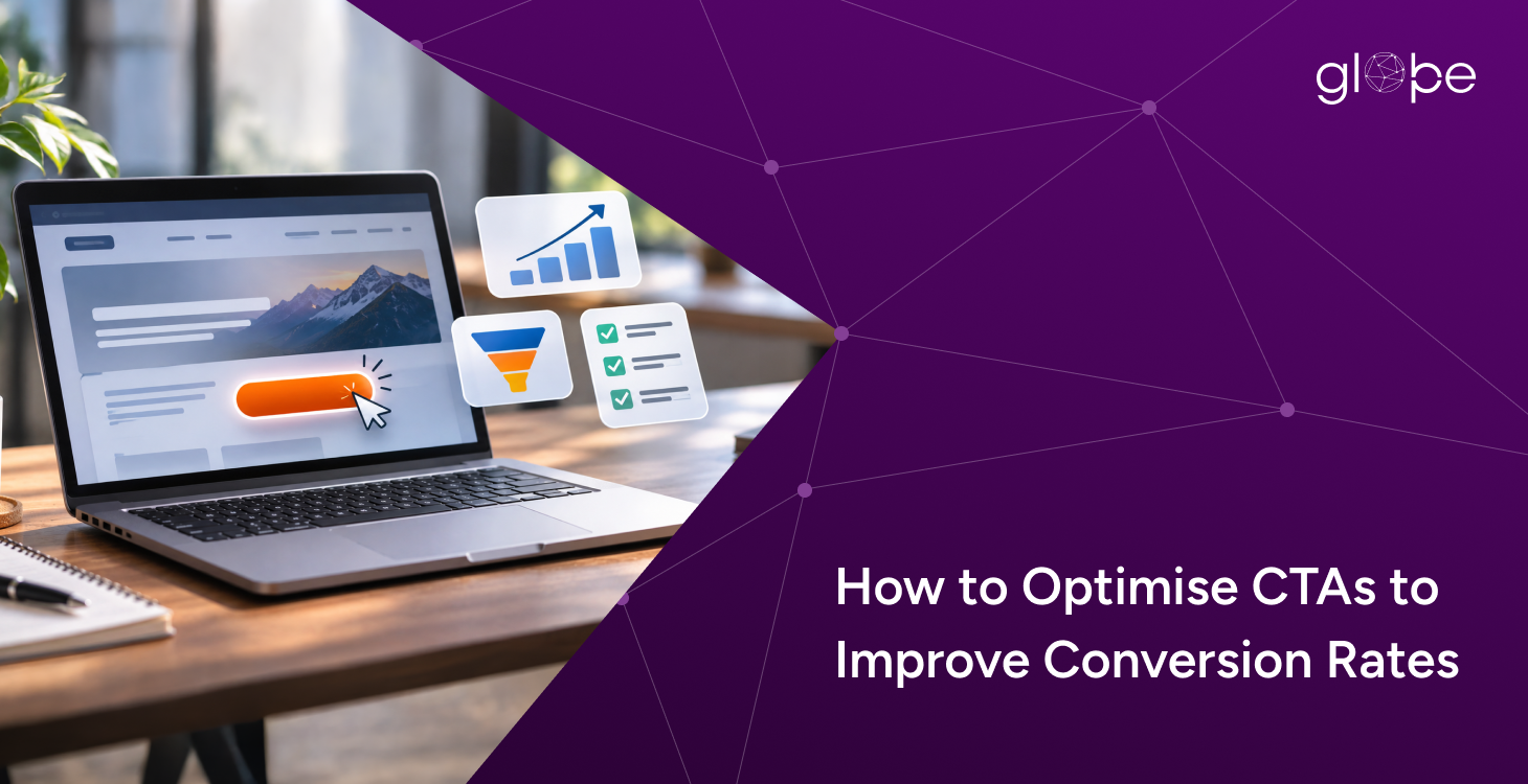
However, a prominent button alone cannot guarantee better conversion rates. Businesses must align CTA messaging with user intent, create a frictionless experience, and measure what happens after visitors click. A systematic approach to CTA optimisation helps businesses improve website usability, strengthen lead generation, and make better use of existing traffic.
1. Write CTA Copy That Matches User Intent
CTA copy should clearly communicate the next step and set appropriate expectations. Specific phrases such as “Get a Free Quote,” “Book a Consultation,” and “Add to Cart” explain the intended action more effectively than generic labels such as “Click Here.” The right wording also depends on the conversion funnel stage. Visitors researching a service may prefer “View Our Portfolio,” while users ready to engage may respond better to “Discuss Your Project.” Businesses should match the CTA's commitment level to the information available and the visitor's readiness to act. Clear, benefit-focused language helps users understand the value of clicking without creating unrealistic expectations.
2. Improve CTA Design, Visibility, and Accessibility
CTA buttons should stand out through a clear visual hierarchy, sufficient contrast, readable typography, and appropriate spacing. Consistent styling helps users recognise interactive elements, while a prominent primary CTA directs attention towards the page's main conversion goal. Secondary actions, such as viewing a portfolio, can remain visible without competing with the primary button.
On mobile devices, buttons should be easy to tap and should not be crowded by nearby elements. Accessible colour contrast, descriptive labels, keyboard navigation, and visible focus states also support a better user experience. Design choices should make the intended action easier to identify, with their actual effect on conversions evaluated through testing rather than assumptions about which colours or styles perform best.
3. Place CTAs at Relevant Decision Points
CTA placement should reflect the page structure and the information users need before making a decision. A landing page can introduce its primary CTA near the beginning, allowing ready-to-act visitors to proceed without unnecessary scrolling. Additional CTAs may appear after service benefits, customer testimonials, pricing information, or answers to common objections.
Longer pages can repeat the primary action at appropriate intervals, provided each placement supports the user's journey rather than creating distraction. Businesses should also consider the relationship between the CTA and its destination. A button promising a consultation should lead to a relevant booking or enquiry experience, maintaining consistency between the initial message and the next step.
4. Reduce Friction After the Click
A successful CTA click does not necessarily result in a completed conversion. Visitors may abandon the process if a form requests excessive information, pricing is unclear, pages load slowly, or checkout instructions are confusing. Businesses can reduce friction by removing unnecessary form fields, explaining what happens after submission, displaying relevant trust signals, and making error messages easy to understand.
Ecommerce websites should provide clear product, delivery, and payment information throughout checkout. The objective is to make completing the intended action straightforward across devices. Reviewing form abandonment, checkout completion, and other relevant user behaviour can help identify where potential customers encounter difficulties.
5. Measure CTA Performance and Run A/B Tests
CTA optimisation should rely on measurable outcomes rather than personal design preferences. Click-through rate (CTR) measures how often users click a CTA relative to a defined number of eligible views or users, while conversion rate measures how often the intended action is completed relative to a defined audience or number of sessions. For example, if 2,000 eligible visits generate 100 conversions, the conversion rate is 5%. If a tested version generates 120 conversions from the same number of eligible visits, the observed rate is 6%—a one-percentage-point absolute increase.
This difference alone does not establish statistical significance or prove that the CTA change caused the improvement. A/B testing should compare clearly defined variations, use consistent measurement methods, and collect sufficient evidence before a decision is made. Businesses should prioritise completed enquiries, qualified leads, or purchases over clicks alone.
Ready to improve your website’s conversion rates? Contact Glopbe for conversion-focused web design and digital solutions that turn visitors into customers.
Frequently Asked Questions
1. What is CTA optimisation?
CTA optimisation is the process of improving call-to-action wording, design, placement, and destination to encourage users to complete a specific action. It forms part of conversion rate optimisation (CRO) and focuses on making the next step clear and accessible.
2. How can CTAs improve website conversion rates?
CTAs can support higher conversion rates by communicating a clear benefit, matching user intent, and directing visitors towards a relevant next step. Their effectiveness also depends on the destination page, overall user experience, and the amount of friction in the conversion process.
3. Where should a CTA be placed on a webpage?
A CTA should appear where it is relevant to the visitor's decision-making process, such as near the beginning of a landing page or after important benefits, pricing details, and trust signals. Placement should reflect the page objective and user readiness rather than follow a fixed rule.
4. How do you measure CTA performance?
Measure CTA click-through rate, completed conversion rate, and relevant business outcomes such as qualified leads or purchases. Use consistent definitions and analytics tracking to understand whether clicks lead to meaningful results rather than treating button interactions as the final measure of success.
5. How does A/B testing help optimise CTAs?
A/B testing compares two CTA variations to determine whether one produces better results against a defined objective. Businesses can test wording, placement, or design while controlling other important variables and collecting sufficient data to evaluate whether the observed difference is reliable.
Cleanup order is easy to get wrong.
Get expert help from Globpe.
Your website should make it clear who you are, what you offer and what visitors should do next. Whether you are launching a new digital presence or improving an existing website, start with the goals, customers and opportunities that matter most to your business.